−Table of Contents
Available Templates
These are shown below in alphabetical order.
Vote results
The results of the vote carried out by members of OT via email to the 6th Feb 2015 are that the wikipedia style template (monobook) was the favourite, although not quite a majority view. James Kemp will be looking into a method of allowing people to choose their own template. However until then the winning template will be used.
| Option | Votes for |
|---|---|
| Wikipedia | 22 |
| Taratasy | 12 |
| Default | 11 |
| No preference | 5 |
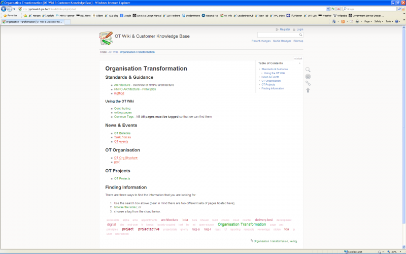
Default
This is the template that comes with dokuwiki. It is a very clean interface and you can pretty much be certain that all the tested plugins will work fine with it. The user menu is layered on the top left of the screen, along with the search box. The page menu (create/edit, view revisions etc in a floating bar on the right with a hover menu when you put your mouse on it).

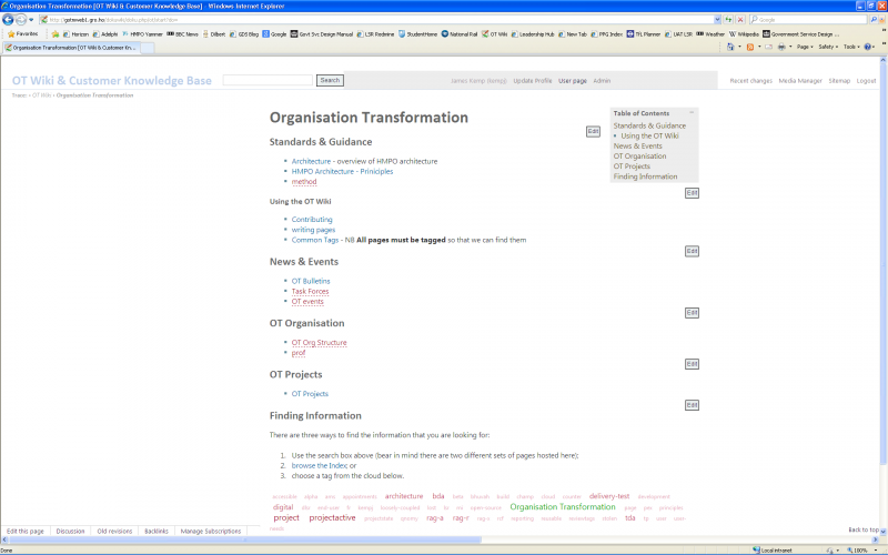
Taratasy
This is a similar template to the default one and has a minimalist look to it. It works very nicely on large screens but can end up with some overlapping of the user menu on smaller screens. This is the template that the OT wiki is currently using, so you can try it out for yourself. The user menu is spread across the top of the screen and the page actions are along the bottom left.

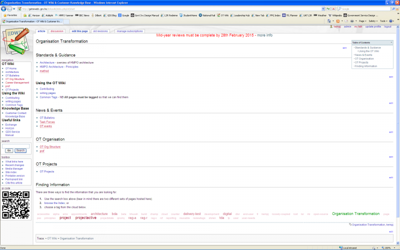
Wikipedia
This template is actually called Monobook but it is designed to mimic the interface for wikipedia, probably the most famous wiki in the world. It adds a semi-static left hand navigation bar and also a site notice facility across the top of the page. The main pages are then loaded into the frame. This brings advantages in navigation, but at a cost of slightly less space for page content. There is a toolbox section which gives you some additional functionality not included in the other two templates. Notably a 'backlinks' feature and printer friendly version without the sidebars. All the user menu and page actions are at the top of the page and the bottom of the page is only for information.
